Aesthetics of Design Portfolio
Portfolio for Aesthetics of Design, Spring 2024
CU Boulder offers a class called “Aesthetics of Design”, offered at both the senior undergraduate and graduate levels. Throughout the course, I made several artifacts. What follows is a portfolio of the artifacts that I am most proud of. They can also be viewed on the website linked above, and they are copied over here for a more permanent home.
Upcycle Project
Aesthetics Exploration - Minimalism
I have always appreciated design that simplifies complex tasks in a beautiful (but simple) way. I feel as though a lot of design can be distracting, but thoughtful and simple design can serve as a way to allow someone to focus on what is important to them.
The minimalism movement as a philosophy had its start in the early 19th century in the United States by the likes of Ralph Waldo Emerson and Henry David Thoreau, who believed that “insight and enlightenment can be gained through solitude and simplicity”. The modern style of minimalism, however, was heavily inspired by the Bauhaus School in Germany during the early 20th century. It features a strong emphasis on basic shapes such as rectangles and circles. An example of this is in the Bauhaus logo itself, which was designed by Oskar Schlemmer in 1921.
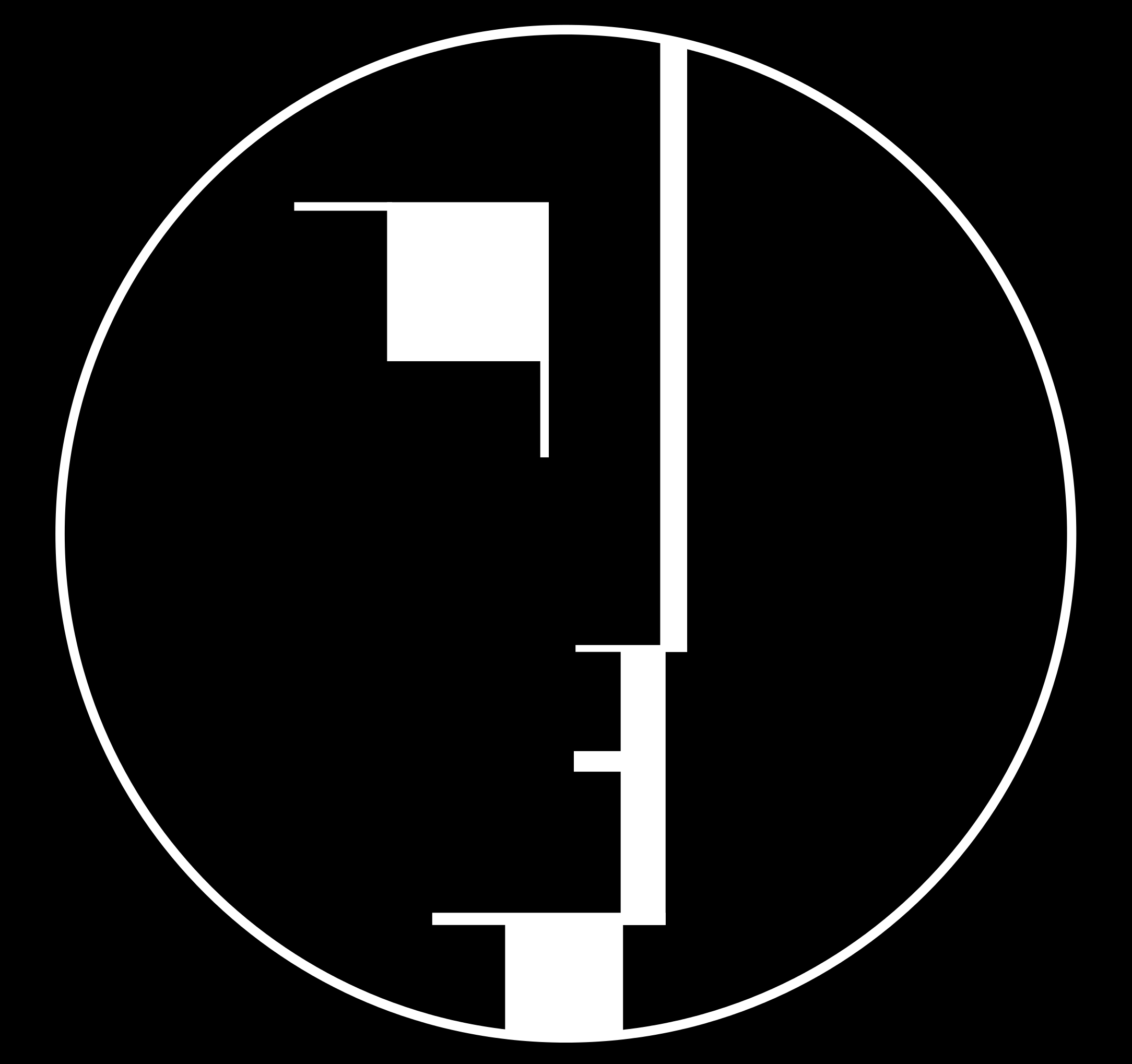
We can see that this logo shows a face in side profile, however it uses only lines, squares, and circles. The color palette as well is also simple, just black and white. These shapes can also be seen in architecture. The most logical example of this is perhaps the Bauhaus School itself in Dessau, Germany:
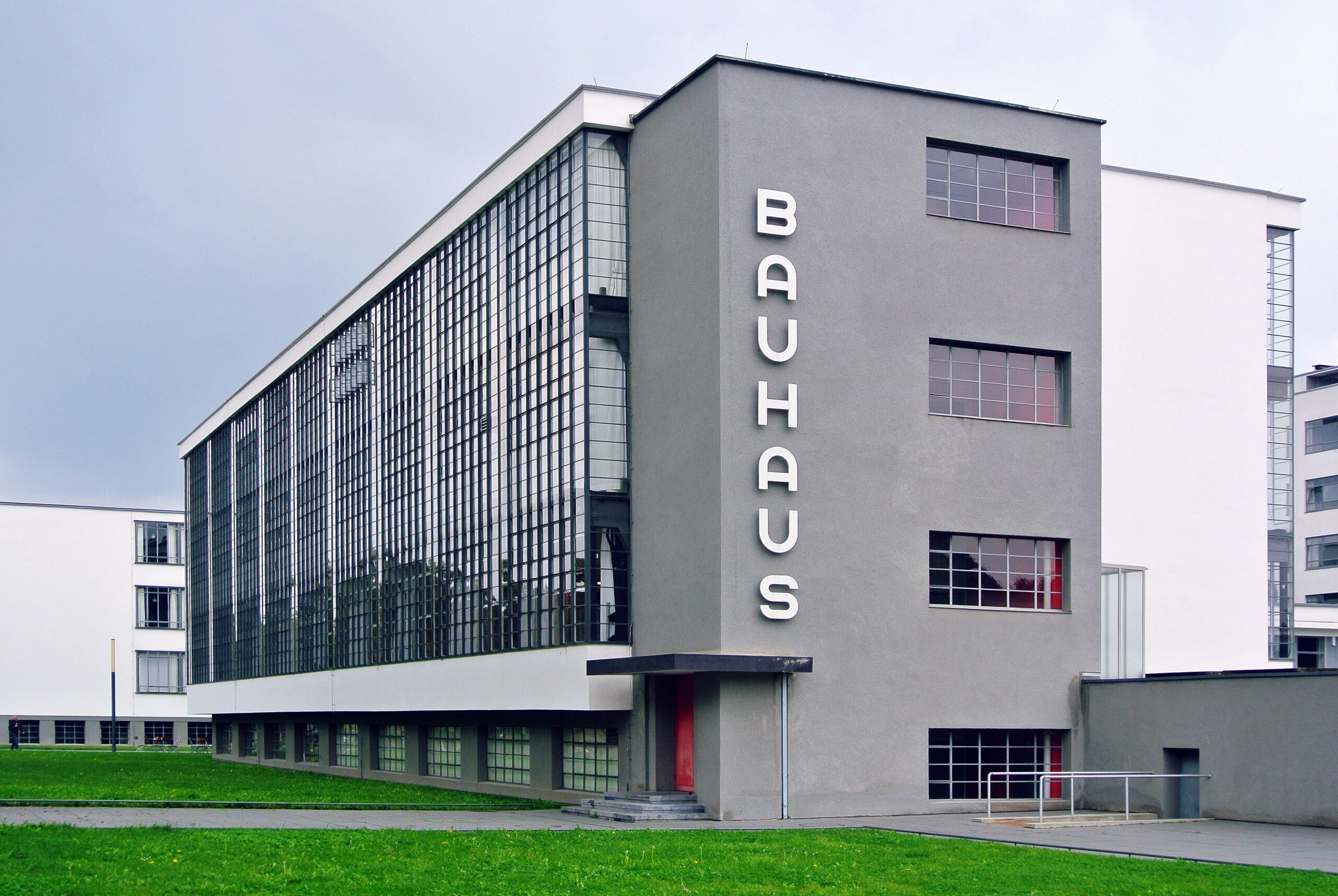
Much like the Bauhaus logo, we can see that the building itself is composed almost entirely of simple colors (white, black, and gray with some red touches) as well as glass to allow for natural sunlight to enter the building.
One of the most influential figures in minimalism who brought the Bauhaus ideas into the mainstream is Deiter Rams. He is a German industrial designer that is known for his “Good design” principles that many minimalist (and non-minimalist) designers use to this day to assess the quality of their designs. Some of the rules he outlined are “is innovative”, “is unobtrusive”, “is as little design as possible”, and “is long-lasting”, among others. Some of his most famous works are the Vitsœ 620 Chair and the Braun ABW 30 clock, both shown below.
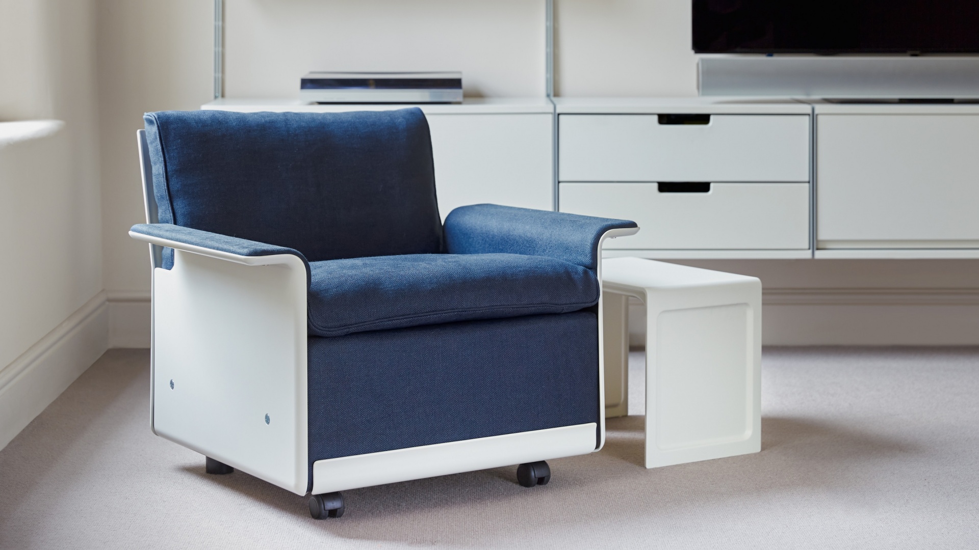

The Vitsœ 620 Chair is able to have multiple assembled into a sofa. The two screws on the bottom disconnect the armrest and allow for two chairs to be screwed together to form a sofa, with the armrest being attached at the end of the two couches that are now screwed together. Furthermore, the chair itself is designed to be extremely easy to be assembled and is made out of high-quality components. Both of these are factors that show the long-lasting and simple design advocated for by Rams.
The Braun ABW30 clock is also extremely simple. Much like the Bauhaus logo, it only has two colors and the arms are of two distinct sizes, making it easy to tell the time.
Both Dieter Rams and the Bauhaus school were inspirations for Jony Ive, the former Chief Design Officer at Apple. Two examples of this are the original iPhone and the old MacBook Air model.


While both of these were groundbreaking and impressive machines when they were released, what I find most impressive and most telling about their aesthetic is that they still look good, 16 years later. To me, that is what good minimalism should do. Not only should the designs be made out of quality materials (i.e. metal and glass), but also be timeless.
Upcycle Aesthetic: Organic Shapes and Knife Woodblocks
The knife storage solution in my apartment is currently precarious, to put things lightly. All of our knives are currently in a drawer in random orientations with knives of various lengths. They also happen to be somewhat near other cutlery, like forks and spoons, which means that it is a small miracle all of my roommates and I haven’t seriously cut ourselves. I’m honestly too embarrassed to take an actual picture of our knife/cutlery drawer, but it looks like a messier version of this picture:

This problem led me to thinking about creating a knife block to store my knives. Not only would it solve a genuine problem I have, but it would also allow me to explore something that could have subtle design cues that I like while also being sustainable. The sustainable aspect of this knife block is the sourcing of the wood itself. I have a friend who works extensively with wood on various projects. As such, he has a significant amount of scrap wood that would otherwise be thrown away. Instead of discarding it, he and I discussed using the various scraps of wood to create a wood block. This would create a unique, one of one pattern for the knife block. Not only would this look different compared to other knife blocks, but it would also put a significant amount of wood to use that would otherwise be discarded.
The design of the knife block itself is something that I have given considerable thought to, even if some of the design changes that I want to make to it are subtle. There was an interview with Craig Federighi, Apple’s head of software design, where he mentions that human faces have an lot of curves, so it makes sense to have the software reflect that. This can also be seen in other Apple-designed areas, such as the staircase railing design in Apple Park:
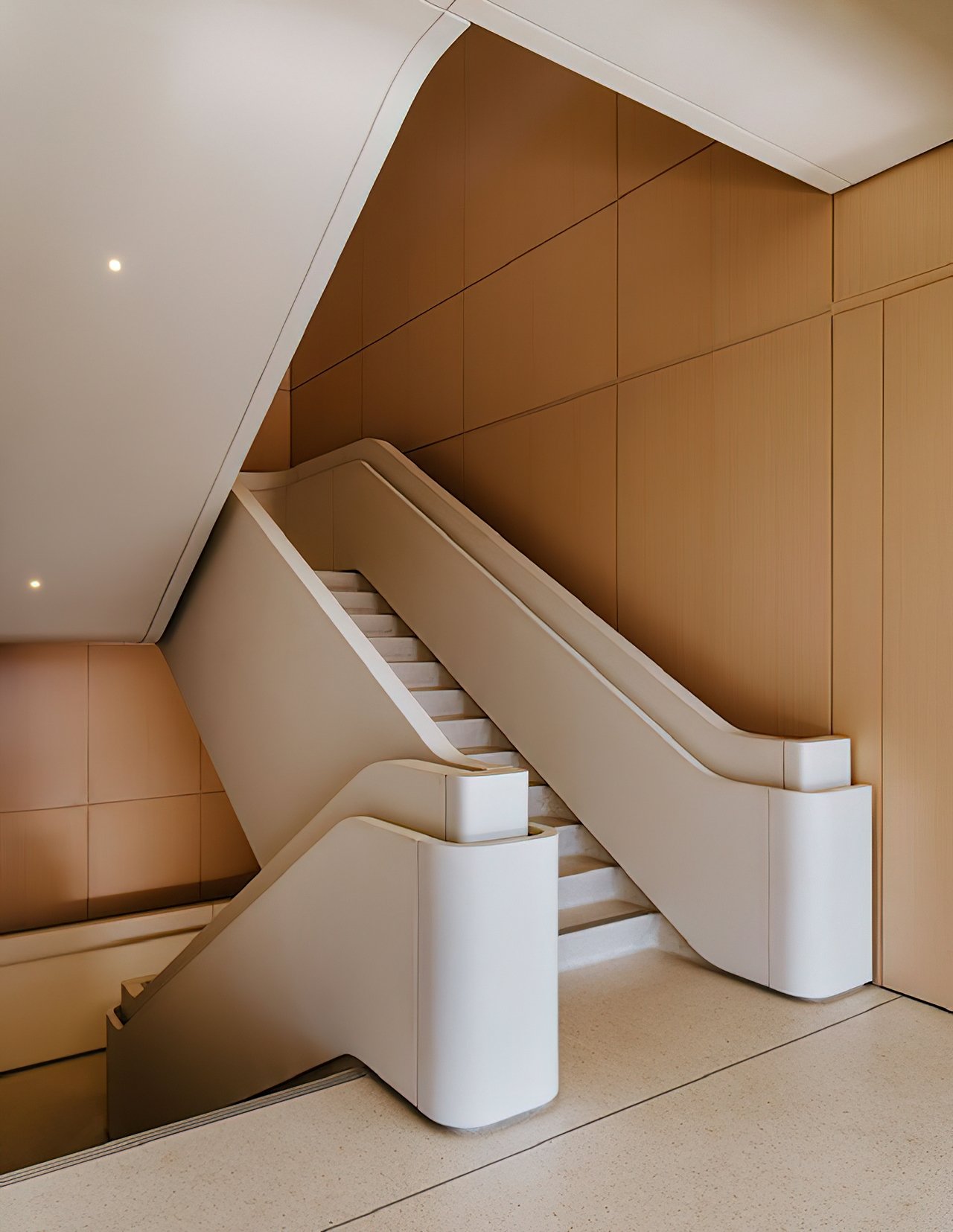
Most staircases have sharp edges, but these have a radius of curvature and there are very few harsh edges. This desire to erase perpendicular edges and create a knife block that looks organic is something that I am going to attempt to pull off.
The most differing aspect of my knife block will be that it will be made out of a single sanded piece of wood sandwiched together. Most (if not all) knife blocks are actually made with two pieces of wood, as can be seen here:

My design would get rid of this line, and instead feature one continuous line, from the top of the knife block to the waterfall edge to the base. The block would also not have the sharp angles that can be seen at the rear of this knife block, instead continuing the line from the rear until it meets the table that it rests on. The cut-outs for each of the knives, as well, would be rectangles with rounded corners instead of rectangles with perpendicular vertices. Again, while all of these design changes are subtle, I believe that (at least to me), this would increase the beauty of something as a knife block that most people don’t give a second thought to.
Upcycle Design Report
Design Inspiration
As a brief recap, my Upcycle project is to use scrap/reused wood to create a knife block that is made to look like it is made out of a single block of wood as much as possible. The inspiration for a knife block specifically came from the fact that the knives I currently have are stored in a few drawers in various orientations, which scares me and isn’t really safe. I also think it would be nice to have a knife block that I can add to as I get more knives, since right now I only have a few.

The image above is what most knife blocks currently look like. The main element that I wanted to change was how this knife block looks like there are two different pieces of wood glued together; one at the front and one at the rear. I don’t like this unnecessary complexity, and believe that a minimalist aesthetic applied to this would involve both of these pieces of wood being infused into one piece, creating an uninterrupted line on the sides. This comes from some of my more organic inspirations, such as the minimalism from Dieter Rams and Jony Ive at Apple Park, an example of which is the organic shape of their stairs:

Fabrication Process
The fabrication process started by first using a knife block that a friend already had and gathering some dimensions from there in order to gain some intuition on the spacing:
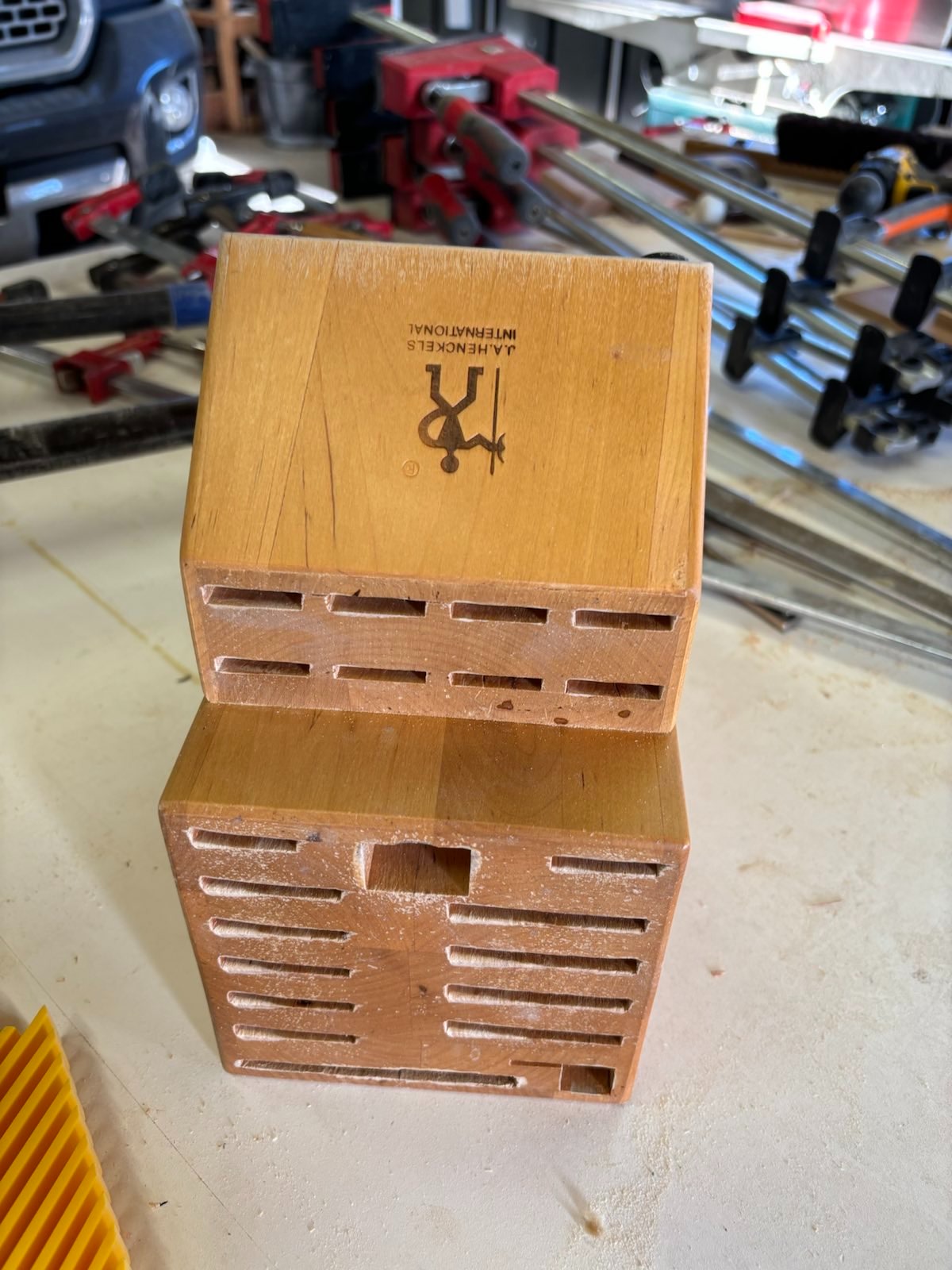
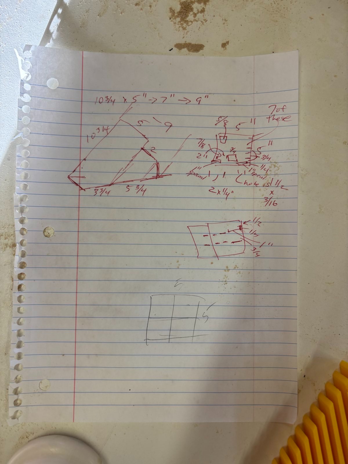
Once the dimensions were gathered, the raw materials were obtained. A long scrap piece of oak was found and was cut into several pieces and glued together to create the overall frame of the knife block. You can see this in the following picture. If you look closely, you can see what looks like four wooden squares glued together (note the difference in grain direction, that’s the giveaway):

The original plan was to cut several incisions similar to the one in the image above on either side of the wood and then frame it with more scrap wood. That was all fine and dandy until this happened:

It might be hard to see, but the wood decided to split. I was going too fast and things started breaking. Not only that, the entire knife block split in half due to some of the wood glue not being able to set correctly. This meant that the entire thing had to be taken apart, sanded down, and then glued again. With a lot of clamps. Like more clamps than you’ve probably seen on something:
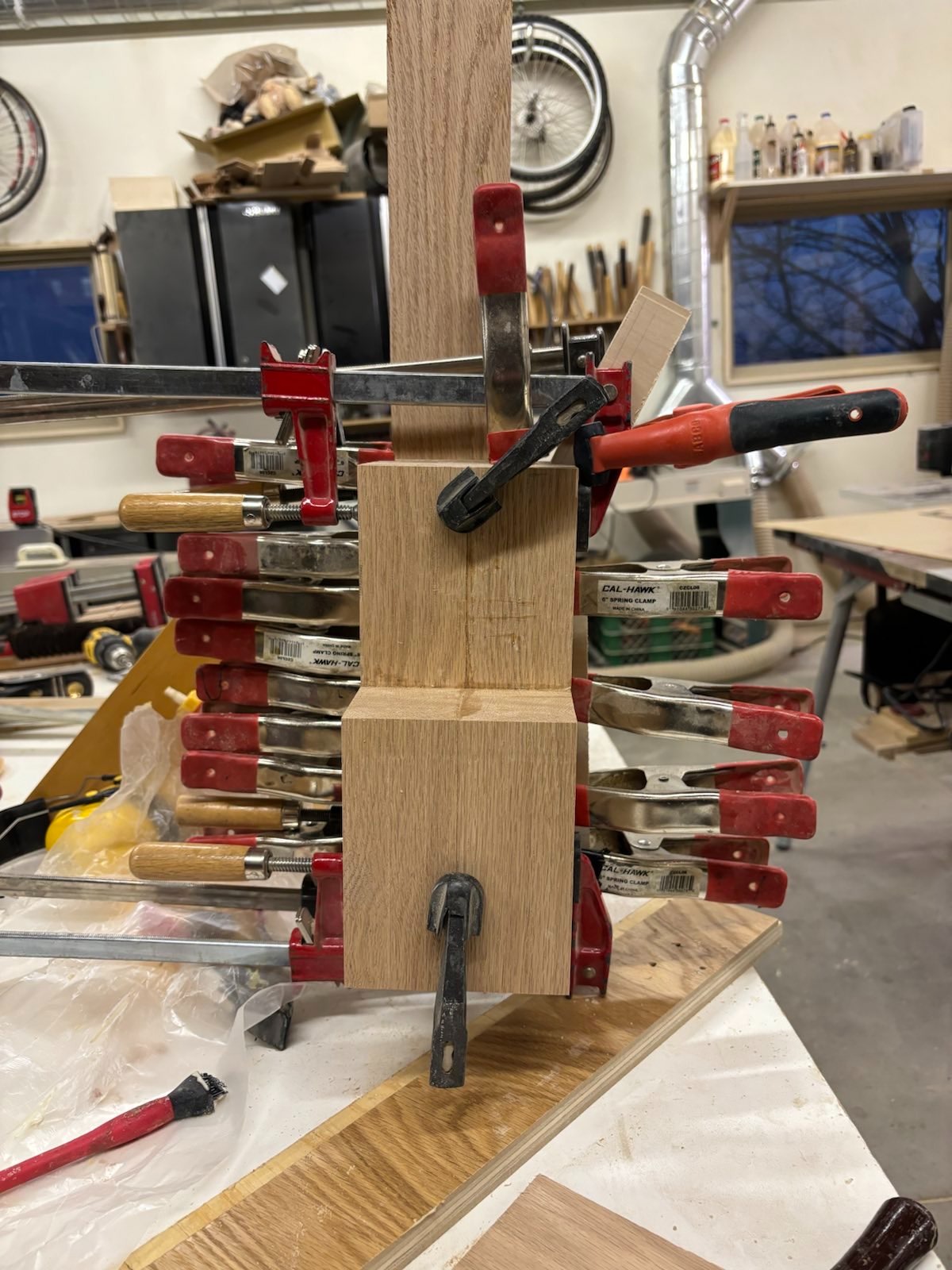
The crazy number of clamps were used to ensure that there was enough even pressure throughout the wood to make sure that the glue would create a solid bond with the wood. This part is really key, since wood is porous and the pressure must be applied over the top of parallel wood grains. Otherwise the glue fails and the entire thing falls apart (again). This set overnight so that the same mistake wasn’t repeated, and thankfully the glue dried and held.
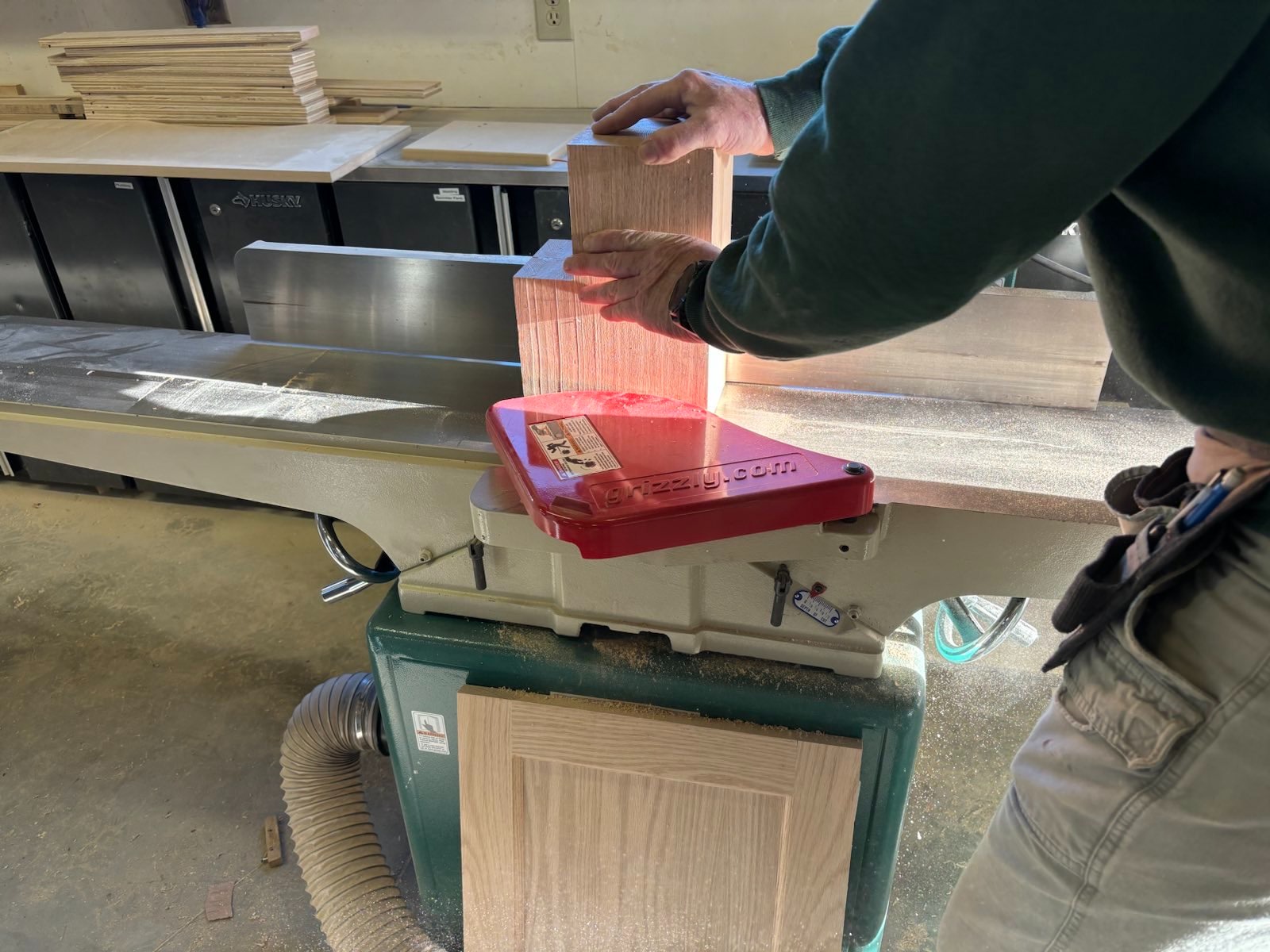
Another part of this experience was working with a friend who is extremely experienced in woodworking. He helped me think through the design, showed me the tools we would need to use and how to operate them, and overall his thought process in looking at a completed product, deconstructing it, and then modifying it to the aesthetic that I was going for. Furthermore, I learned a lot about the sheer amount of time making something like this takes. It was about 12 hours of work over two whole days, not counting the time for the glue to dry, which would add another several hours. The end product, after it was glued and sanded, is something I’m pretty happy with:

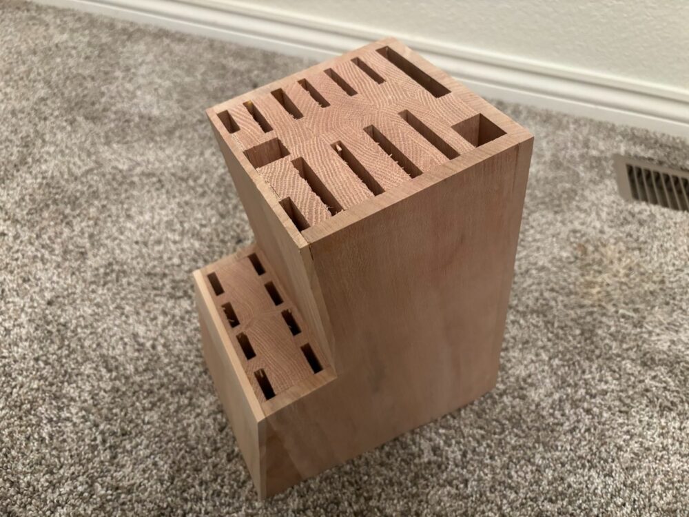
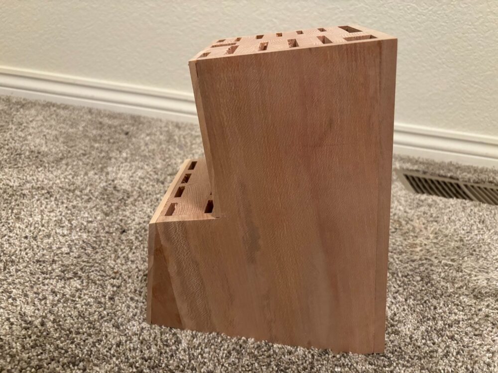
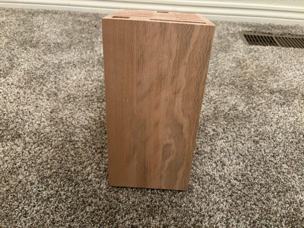

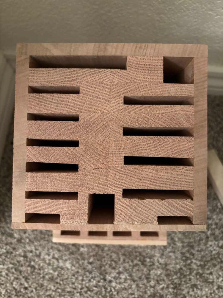
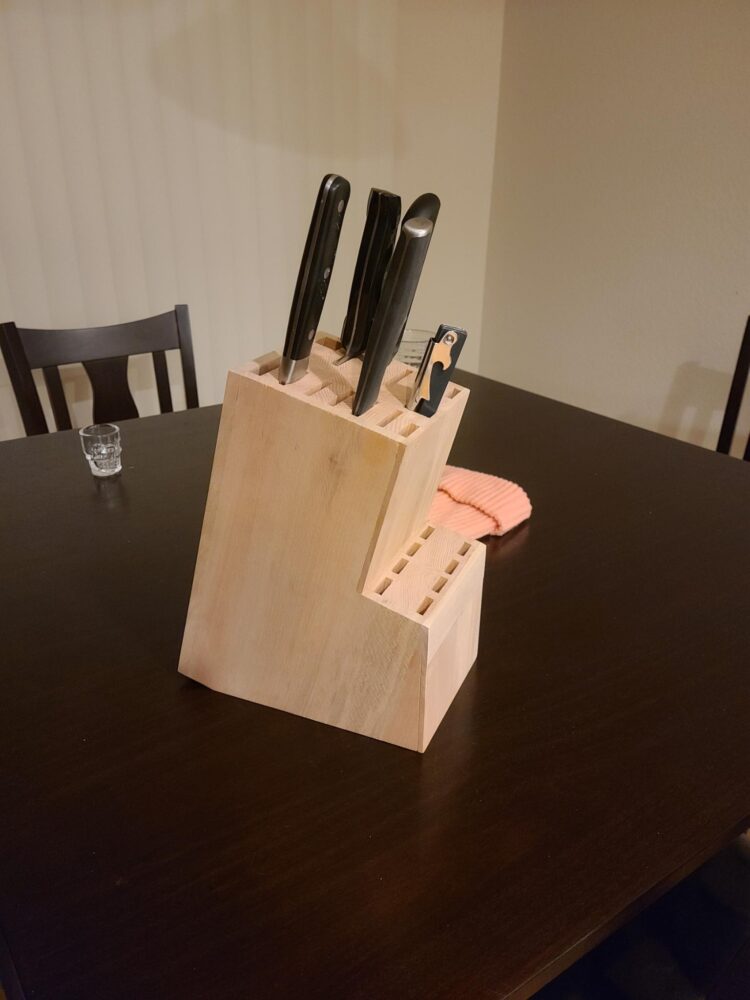
The sanding process was also extremely satisfying. The wood got softer to the touch than I even knew possible, and I also found a piece of birch wood to use for the top portion of the front (that’s the lighter band in the front view). I think it adds a nice splash of color, and when I go to stain the knife block it will add a nice contrast to the rest of the project.
While I didn’t get the rounded corners and edges I was going for by the time this project was due, I am thinking of going in and adding them. That being said, I did get some feedback from some members of my pod that they actually liked the edges and how it lends to an angular feature to the knife block, similar to the angular features from the side. I hadn’t really thought of this, but am going to keep the knife block on my counter for a few weeks as it is and see if I see it the same way, or if I do end up wanting to curve the edges.
I am also going to go in and stain the entire knife block. Professor Hertzberg recommended walnut oil, which seems really interesting and I think would add a nice color to the knife block and make it appear more finished.
Perhaps the best part was seeing the knife block actually hold knives! I had put it in so much work, and I was so nervous that the measurements would be correct, but for some reason the holes would either be too big or too small. But seeing the knives slide right in was really satisfying. This is definitely something I am going to use for (hopefully) years to come, and will hopefully get a lot of love :)
Final Version
Here’s the knife block stained an in use in my kitchen:

Main Project
Main Project Plans
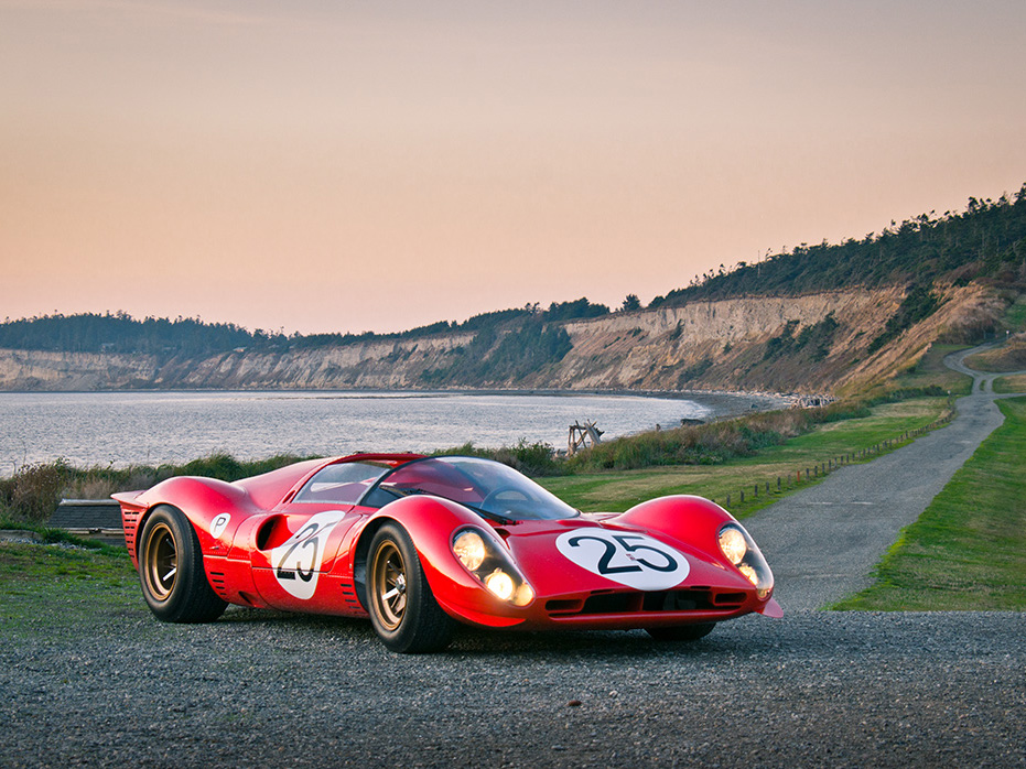
I think my personal aesthetic is something maybe related to timeless design. My mom’s side of the family is from Italy, and as such, the places there have influenced me significantly. Furthermore, being born in London has also influenced me in many other ways. I am also a massive fan of Ferrari’s Formula One team and the company as a whole. I believe that Ferrari is able to combine art and engineering unlike most other companies today. There are a few others, like Pagani Automobili, Apple, and IKEA more from a purely design perspective. However, none of those companies have the racing pedigree or command the same amount of passion that Ferrari does. One of their cars that comes to mind for me is the Ferrari P4, which was an endurance race car that competed in the late 1960s.
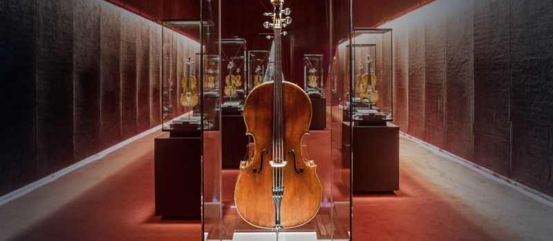
Another major aspect of my life that has influence over the aesthetic is that from the music world. I’ve been playing the cello for over 10 years, and because of that I’ve spent a lot of time in symphony rehearsals and with my own instrument specifically. I’ve always loved how it looks, and while it’s hard to describe in text, the comfort I get from playing mine is sort of like hugging a really close friend. It feels familiar, and to me, the cello as an instrument still looks good, hundreds of years after its design.
I have also been heavily inspired by nature, specifically growing up in the Pacific Northwest in Portland, Oregon. One of my favorite places to visit there are the Portland Japanese Gardens, which are widely considered to be the most accurate Japanese gardens in the world outside of Japan. The gardens themselves are part of a 400-acre park in Portland that overlooks the city and is reserved for people hiking, biking, and otherwise enjoying Portland. No development is allowed on it by law, which is something I’ve always appreciated. Even though I have been going to the gardens for over a decade, they have always evoked a sense of peace and connectedness inside of me. It’s pretty impressive when I think about it; the design of the gardens hasn’t fundamentally changed since its construction, but it still looks amazing no matter the weather and still makes me feel something very few other places can.

One thing I have always appreciated about the Portland Japanese Garden is how the entrance and existing architecture blends in so seamlessly with the nature surrounding it. I absolutely love the design of the handrails. They appear to be one long, connected piece of steel that is joined by glass plates. And the concrete footpaths make you feel grounded as you walk up them. It’s very hard to explain over text, but it does make you feel as though you are floating in a forest.
As far as what my main project plan is, I’m honestly still a bit unsure. I was thinking about making a coaster for my mugs, since I still don’t have one for my desk, but want one that is able to fit multiple diameters of cup within one coaster. It might be an interesting exercise in creating something that is functional, timeless in design, but also minimalist. How much could I actually take away from a coaster and still have it be a coaster? Is adding something that is necessary even a good idea? Starting with something simple like a coaster might be a good exercise in minimalism design from the ground up. It’s something I’ve never done before and might lead to something interesting :)
Design Preview Report - Coaster
Initial Thoughts
My initial inspiration for this project came from a desire to have a coaster that fits cups of different dimensions. I have many various mugs and glasses, but have never had a single coaster that was able to hold them all. I’ve definitely had coasters in the past that are able to hold cups of a single dimension, but every other cup dimension has felt forced or not right. I found this picture on Reddit that sums up how it makes me feel pretty well:
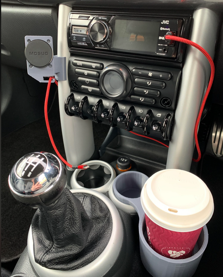
This is the kind of frustrating thing that I have seen about cup holders. Why are they so friggin small?? Someone shouldn’t need to 3D print something to be able to fit a regular coffee cup in it.
As far as aesthetics go, I have been exploring minimalism for most of this semester, and really wanted to try to incorporate more curved edges into this design. In my Upcycle project I wasn’t able to include as many rounded corners as I would have liked due to the fabrication process, but I thought that this project would be a good opportunity to do that.
Inspirations
This is drawing a bit from two posts ago, but I figured it was worth repeating here. I have always loved the Portland Japanese Gardens, specifically how their design has always felt timeless. I’ve been going there for over a decade and always feel at peace and rejuvenated by visiting.

In a similar vein, I own a mug by Kinto Japan that is made using local artisan techniques that have been around for hundreds of years. The mug itself is an absolute joy to hold, even though it looks so simple:
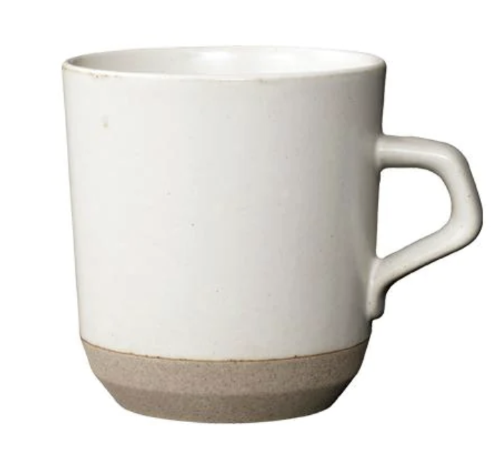
These are what formed the basis of my design aesthetics. I really wanted to try and push myself to use as few 90 degree angles as possible, focusing as much on curves as I possibly could and using as little material as possible.
Opposite Aesthetics
Two main opposite aesthetics I found were that of the Baroque and steampunk styles. I was struggling to come up with good sketches for coasters that would follow those respective aesthetics, so I turned to DALL-E for the first time, and it came up with some designs that captured what I had in my head exceptionally well.

This really captures the opposite aesthetic of what I am going for. The main difference is how ornate and detailed the coaster is. There are a seemingly infinite number of flourishes and ornamentations present. My eyes are drawn towards the main five “nodules”, but then are quickly drawn towards what are surrounding them as well as the cherubs that are shown. It all becomes really overwhelming, and then my eye eventually realizes that the entire thing is made out of marble, like most sculptures of the time.
The other aesthetic is steampunk, which I also used DALL-E for:
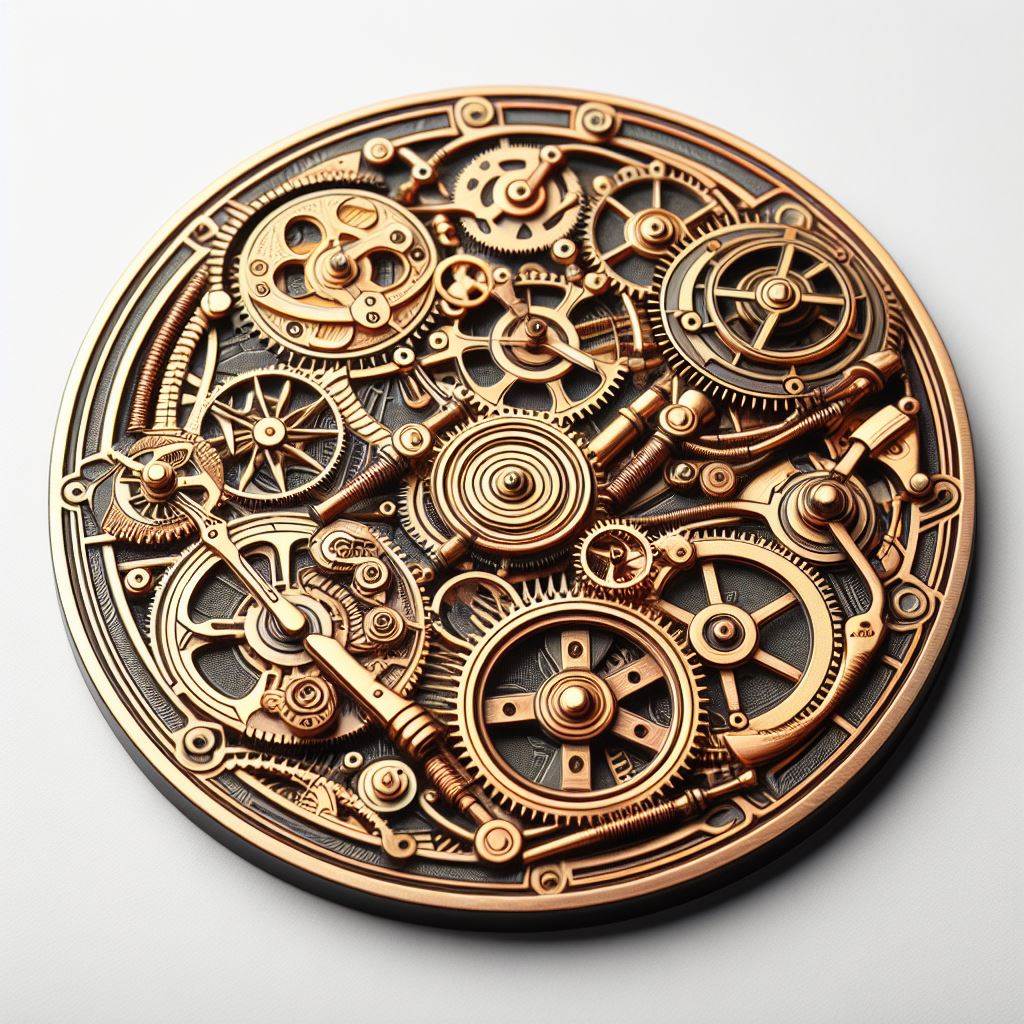
While this is also a very busy design, it is busy in a different way than the Baroque style one before. Instead of focusing on marbled flourishes, this focuses on using gears and mechanisms to create a sense of busyness and clutter. On the one hand, I do like imagining all of the different things that these gears could power (it sort of looks like a mechanical watch face), but on the other, I really dislike how much clutter there is, especially since I know that none of it is functional.
These two opposite aesthetics didn’t really influence my design that much, mostly since I knew that I wanted something that was simple and pleasing to both look at and use.
Some Initial Renders
What follows are some very rough renders of my thoughts. The base of the coaster is able to accommodate mugs that are 50mm in diameter, increasing by increments of 5mm until it reaches 80mm. It sort of looks like a tiered cake, and to be honest I’m not sure if I like the design.
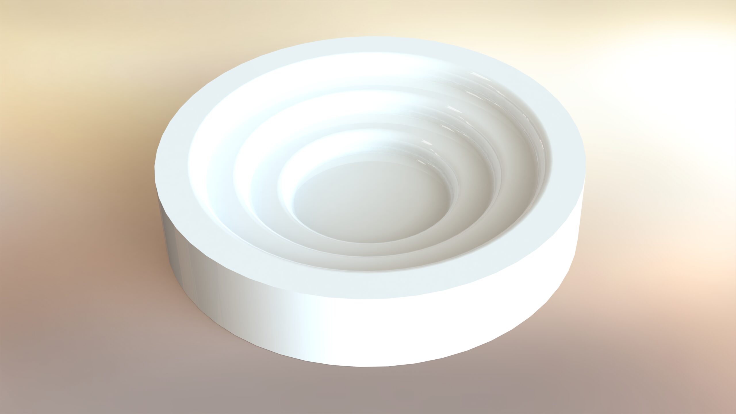

The one thing I do like about the design currently is the color, Most of the things on my desk are dark (the desk itself is black), so having something that is white would not only stand out from an aesthetics perspective, but would also mean that I could see it from my peripheral vision and could place a cup down inside of it entirely by feel without needing to look away from what I’m doing or working on. The number of times that I have tried to do that and nearly spilled something hot on myself and/or my laptop is too high. And I don’t think I’m the only one. So hopefully making it out of a color that is pretty much the opposite from everything else will help significantly with that problem.
Next Steps
Fabrication is going to be 3D printing, most likely out of white PLA with the option to make this out of white resin using a FormLabs 3D printer, which I have already used extensively on my senior design project, so it’s a machine I feel comfortable with. Next steps are roughly the following:
Next week (18 March): Iterate on the design. Take some more measurements of different cups and test fits.
1 April: Print some prototypes and consider adding in flexible resin for a more streamlined up experience
8 April: Try seeing how a curved bottom might work. Could the bottom be filleted somehow to get rid of another curve? What would happen if it tilted with something inside of it? Can you put a cup in there blindfolded just by feel?
15 April-end: Extra time since something is going to go wrong, I’m going to want to change something, or something I haven’t thought of happens.
Final Design Progress
My design so far has had to be completely re-designed. Originally, I was planning on creating something that looked like this:

However, after some really helpful critiques from my pod members, I have decided to redesign my coaster to feature a spring mechanism instead of the multi-tiered level design as shown above. I’ve created some preliminary sketches for this, attached below.
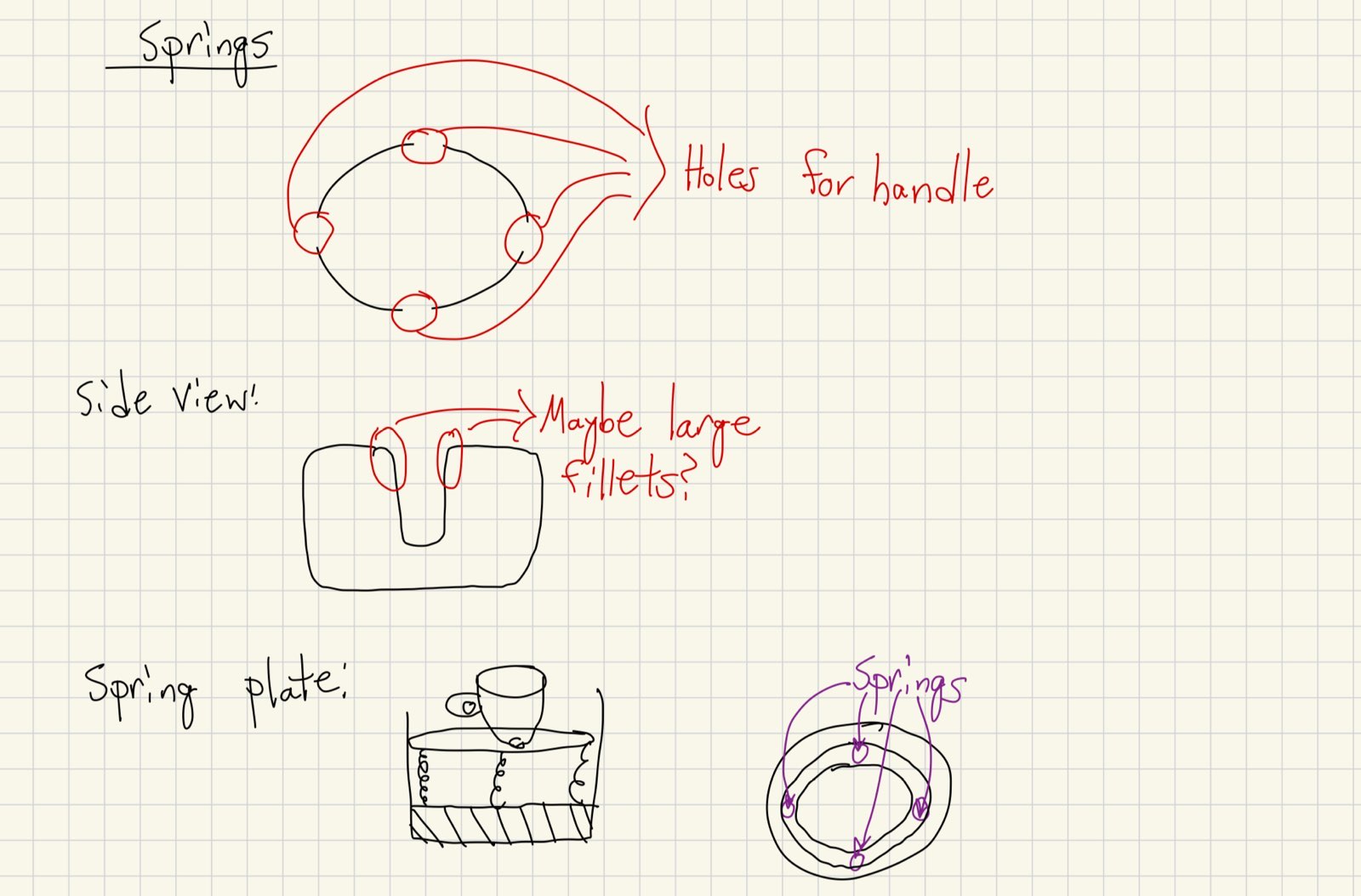
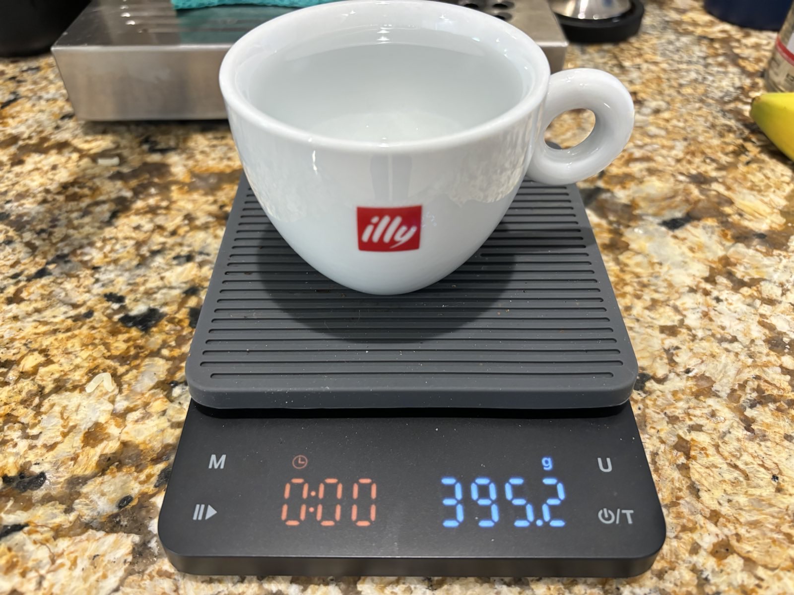
To ensure that the spring would be able to handle one of my large mugs, I took the two most common mugs, filled them with water, and weighed them with a scale:

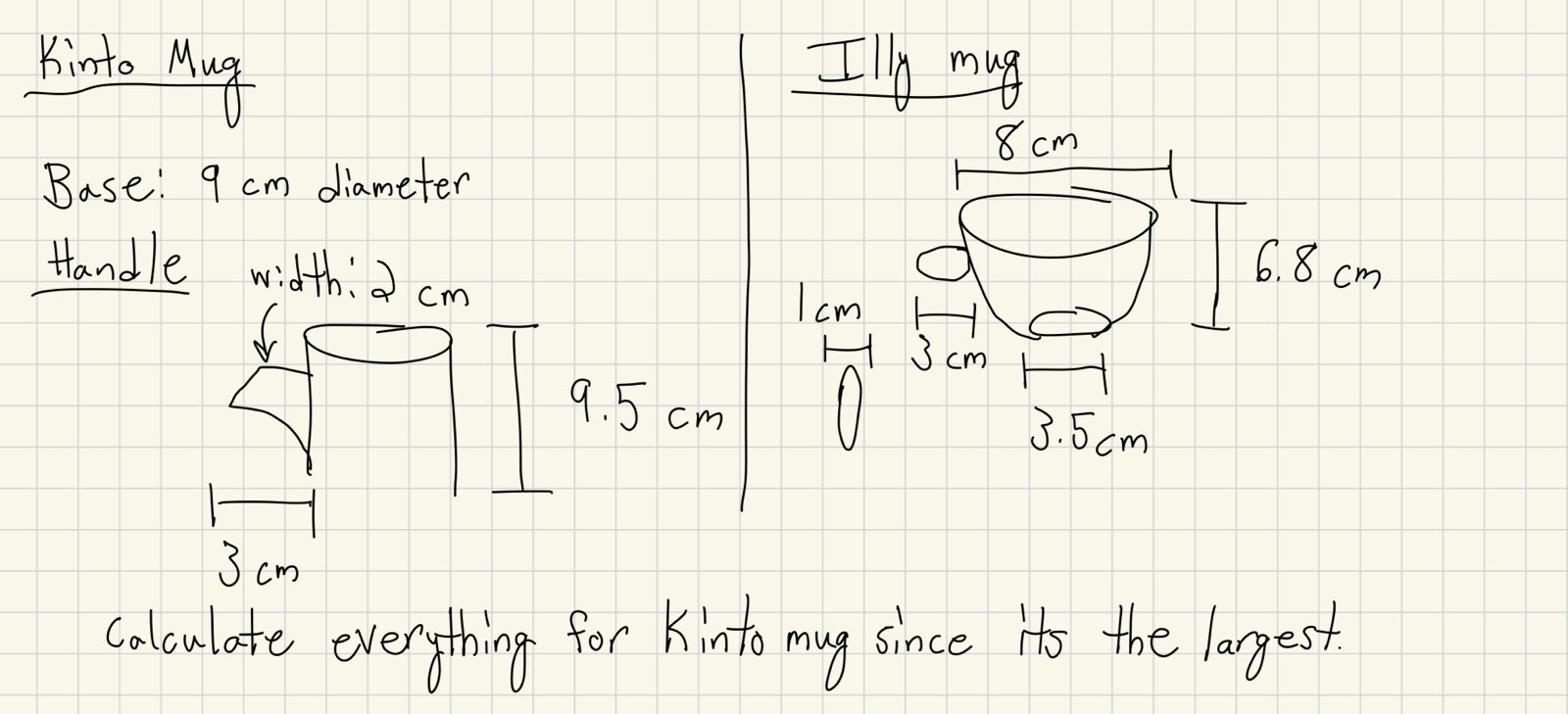
To ensure that the springs would compress adequately, I took some preliminary measurements and calculated the spring constant needed, assuming that I have four springs on the top/bottom and left/right sides of the spring plate on my coaster:
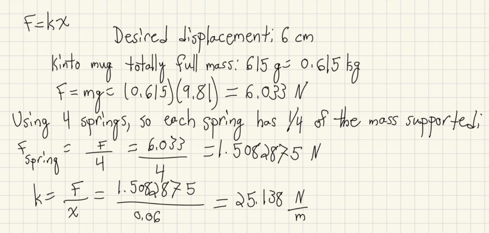
I have since purchased some springs that roughly meet these specifications. I am also currently working on some software that will give me a range of acceptable spring constants that will work given the spring dimensions. Amazon sells several cheap spring sets, so I’m going to see if the dimensions from some of those springs will work well for my coaster.
My immediate next step is to create an updated CAD model, included with the springs. I will also be including slots on the sides of the coaster itself to allow for the mug’s handle to pass through.
Final Report Part One
The Minimalist Cupholder/Coaster
While I have covered this in some of my other posts, I think it would be a good idea to talk about the motivation behind the project that I have been working on. As of now, the cupholder on my desk is a warranty booklet for a Seagate hard drive. It’s literally a small book that you usually flip through to see if there are any stickers inside. While I could have easily gotten any kind of cupholder and solved my problem, I found a problem similar to this one:

This kind of design really pisses me off. Why, in all that is holy, can a regular coffee cup not fit into the cup holder of a car that made it to production? It irritates me like nothing else. I wanted to design something that would allow for a cup to fit inside of it and feel as though it was made for that cupholder.
Aesthetics Inspirations
Throughout this course, I have taken a lot of inspiration from the likes of the Bauhaus movement as well as Dieter Rams and the industrial design group at Apple, specifically under Jony Ive. An example of this that I believe really captures this aesthetic is the design of the stair railings at Apple Park:

I absolutely love how curvy these stairs are, and really wanted to try and challenge myself to create something that is minimalist while at the same time being functional and containing a lot of organic curvature. The curvature, to me, feels organic in a way that is refreshing from a life that (especially for an engineering student) is filled of right angles, harsh environments (looking at you, engineering center designers), and human manufacture. I think organic shapes are grounding and a pleasing contrast to our everyday experiences.
Final Renders
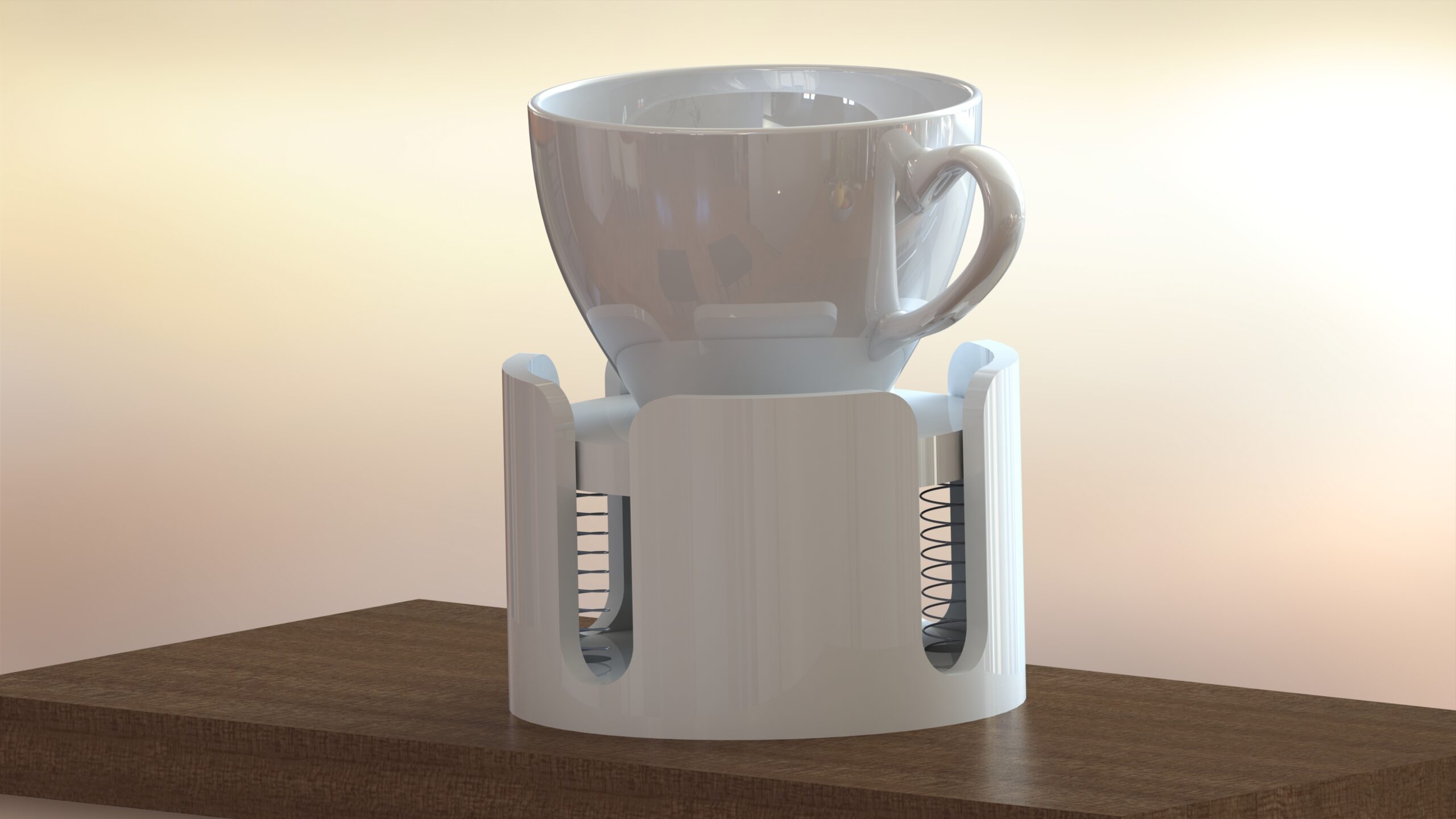
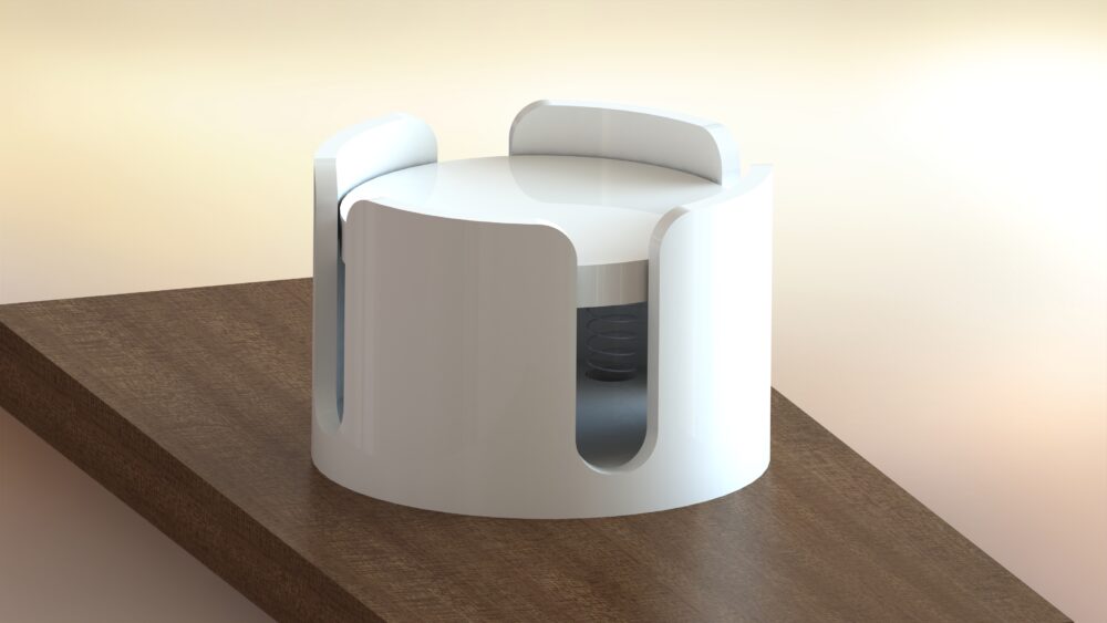
The details of my design will be talked about in much greater detail in the following post (it had to be completely redesigned), but I believe that I have made something that I am proud of. The springs on the bottom of the artifact allow for the mug to be filled with water entirely (I did the math for spring constants for various mugs I own filled with water) and to slot into any of the four slots on the perimeter of the artifact. The white color was chosen so that I can place it on my black desk and see the stark contrast out of the corner of my eye without needing to take away my vision. The ergonomics were also something I gave a lot of thought to; the filleted edges on the top are for aesthetic reasons (organic shapes), however they do provide a bit of tactile feedback, guiding the handle of the mug I’m using into the slot without me needing to look directly at the artifact to align the mug properly, one of the main design goals I had for this project.
Final Assembly
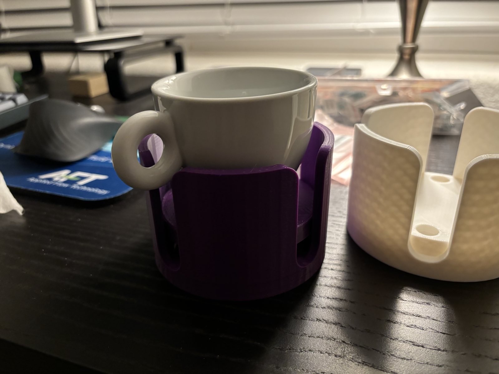
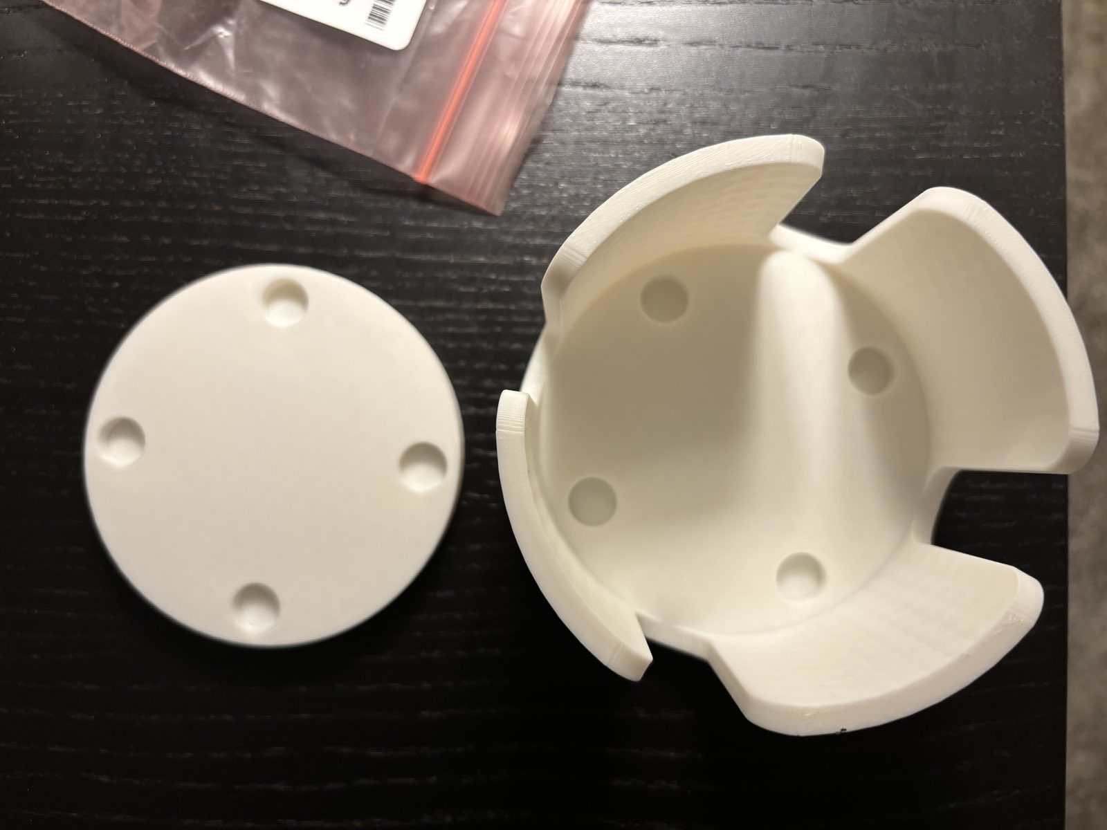

Final Report Part Two
Things Went Quite Wrong
Initially, my design was going to be simple. Really simple, and, quite honestly, too simple. Initially, I was going for something that held cups that looked like this:

The original plan was to improve upon this design, adding room for the handles of various cups. While the design was pure (both in the color but in the fact that each dimension was a multiple of 5), it didn’t have a dynamic component. During my design review with my pod, I realized that I would need to go back to the drawing board. I was honestly a bit upset at myself for feeling like I had made things too simple. But then I took a step back and realized that one of the more difficult things about minimalism that I hadn’t really considered was how fine the line can be between something that is aesthetically pleasing and minimalist, and something that is too simple and is just crap. I had made the latter. And while that was frustrating, looking back on the experience, I think it was a good one. At any rate, I was back to the drawing board. This made my eventual schedule look significantly different than what I had planned:
Original Plan
1 April: Print some prototypes and consider adding in flexible resin for a more streamlined up experience
8 April: Try seeing how a curved bottom might work. Could the bottom be filleted somehow to get rid of another curve? What would happen if it tilted with something inside of it? Can you put a cup in there blindfolded just by feel?
15 April - end: Extra time since something is going to go wrong, I’m going to want to change something, or something I haven’t thought of happens.
What Actually Happened
1 April - 8 April: Redesign the entire thing. From the ground up. Focusing on tactile feel and ergonomics. Incorporate a spring mechanism and maybe some kind of damping system.
8 April - 15 April: Take measurements of various cups and mugs, both filled and empty. Write some code to calculate what the spring dimensions should be, the spring constants, etc. Start modeling work in CAD.
15 April - 22 April: Get springs ordered and delivered, test fits and different colors.
22 April - 29 April: Final assembly and minor tweaks
The Redesign
The next immediate step was obviously to redesign the part. From the feedback with my pod, I realized that I wanted to include some springs in my design so that the cup’s handle would slide into and out of little slots. Here’s what some of the renders of that looked like:
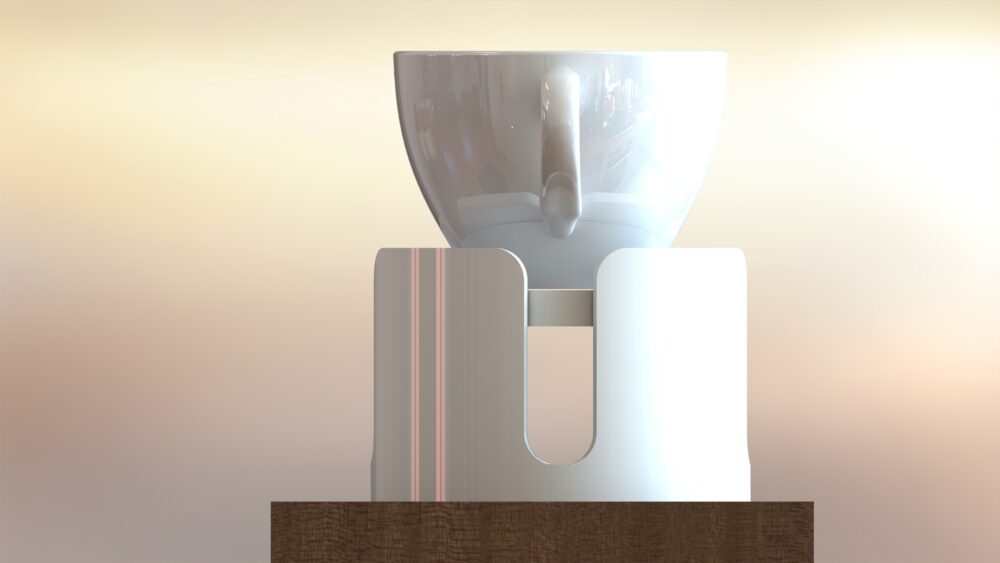

The curved/filleted edges on the top and bottom of the outer “shell” is so that I could place the mug in roughly the right spot and then feel the entrance to the slots without directly needing to look at the artifact itself. The white and brown colors were used to try and get a sense of the contrast between the two, since my desk is darker and the contrast in the peripheral vision is something that was also important for this design.
The Springs
To get an idea of the spring specifications, I used a coffee scale to weigh some of my favorite mugs (especially the biggest/heaviest ones) to gain an understanding of the masses I was dealing with. See images of the mugs above. Once I had these masses, I made a free-body diagram with the masses and used some of the spring equations from Component Design to inform my desired spring dimensions and their respective spring constants.
Manufacturing
The shell and plate were both 3D printed to test fits and tolerances between parts. Incredibly, everything fit together well enough that I decided to keep the dimensions the same for the final version.


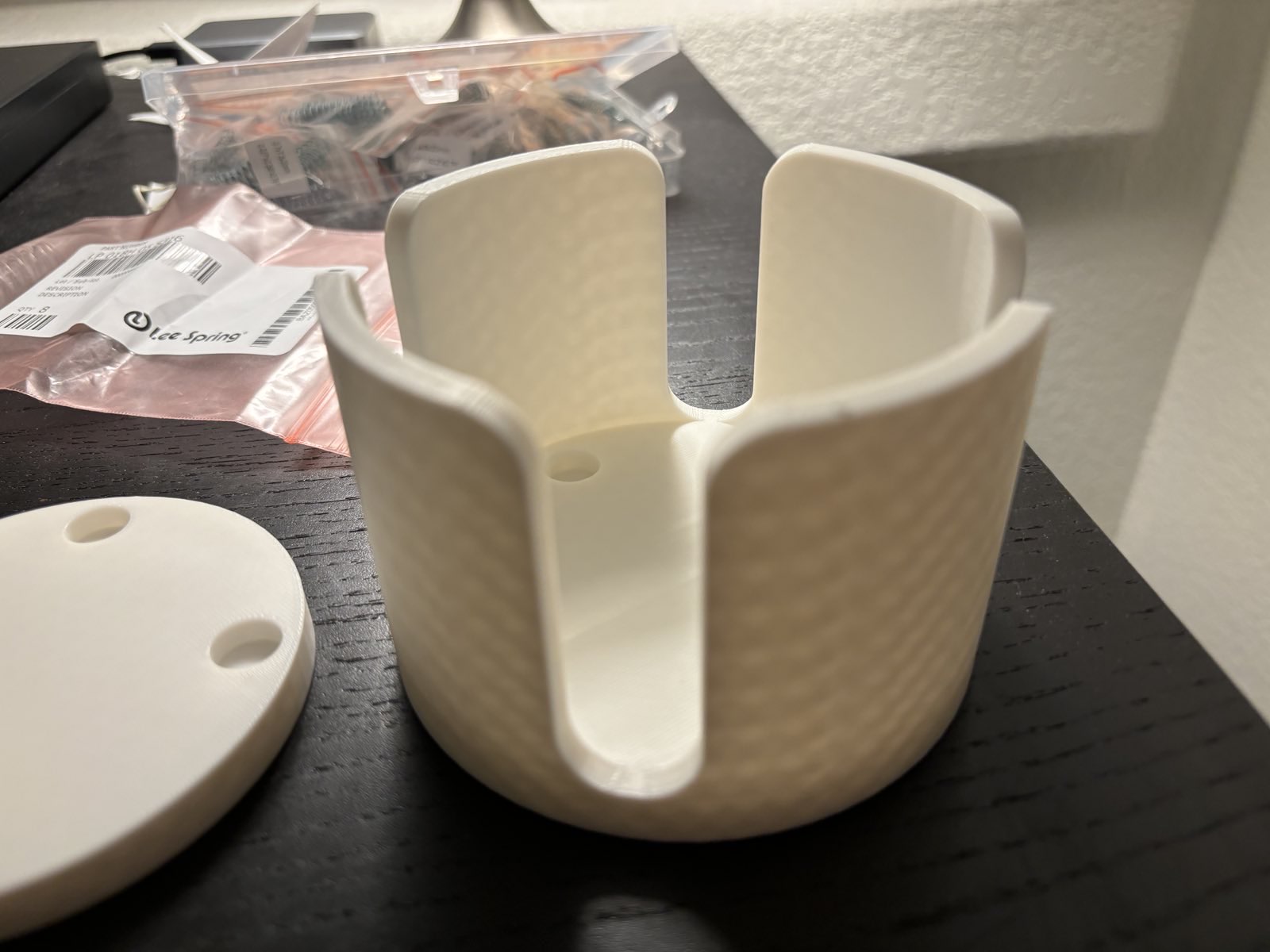
One thing I found was that while the springs I ordered fit the dimensions of the holes I provided, they were too weak. So I had some other (smaller) springs ordered that fit concentrically to provide more stiffness.
Takeaways
Overall, I would say the main takeaway from this project is that minimalism and ergonomics can be challenging if you become lazy or aren’t as focused as you should be. That’s not necessarily a bad thing as long as you learn from it, but it was not something I had expected to hit me as hard as it did. All of that being said, being in a class environment like this and able to recover from this mistake, and also feel comfortable taking the risk to make this mistake, was something I’m thankful for.
Citation
@online{gregory2024,
  author = {Gregory, Josh},
  title = {Aesthetics of {Design} {Portfolio}},
  date = {2024-05-06},
  url = {https://joshgregory42.github.io/projects/aesthetics/},
  langid = {en}
}